
The Liquid Interface & The Tyranny of the Menu
Why the next generation of SaaS will dynamically generate interfaces around real-time user intent.


Open any “Enterprise Grade” SaaS application today, and you are immediately assaulted by the Tyranny of the Menu.
On the left, a sidebar stacks fifty cryptic icons vertically. On the top, a ribbon of dropdowns hides three hundred distinct settings. In the center, a dashboard flashes widgets that you didn’t configure, displaying data you don’t care about.
This is what we call “robust.” We sell it as “power.” But in reality, this clutter is an apology.
We build complex, static interfaces because we do not know what the user actually wants to do. We don’t know if they are here to update a billing address or run a complex cohort analysis. So, in our ignorance, we give them everything. We vomit the entire database schema onto the screen, organize it into arbitrary categories, and hand the user a machete.
“Here,” we say. “You figure it out.”
This approach creates Onboarding Debt. Because the interface is a labyrinth, the user requires a map. Because the map is complex, the user requires a guide. And suddenly, you are hiring a team of “Customer Success Managers” whose entire job is to sit on Zoom calls and tell users which button to click.
We have accepted this as the cost of doing business. We assume that because the problem domain is complex—supply chain logistics, cybersecurity, tax compliance—the interface must be complex.
But this assumption is false. Complexity is not a feature of the domain; it is a failure of the architecture.
In the 100:1 Company, we are dismantling the static interface entirely. We are moving from the era of “Navigation” (users hunting for features) to the era of The Liquid Interface (software generating features).
We are building the Instructionless Product.
The Fallacy of the “Empty State”
To understand the Liquid Interface, we must first confront the greatest failure of modern software design: The Empty State.
The “Empty State” is the moment a new user logs in for the first time. In a traditional application, this is a desolate experience. The dashboard is blank. The charts are flat lines. The software is dumb and waiting for input. It is waiting for a human to configure it because it lacks the intelligence to configure itself.
This moment is where churn is born. The user looks at the blank screen, feels the weight of the work required to fill it, and closes the tab.
In the old world (the “Service as a Software” world), we solved this with biological patches. We instituted the “Kick-Off Call”. We paid an Implementation Manager to take the customer’s data, format it, and upload it manually. We used human calories to fill the empty state.
In the Empty Corporation, the Empty State is treated as a critical system failure.
The Liquid Interface does not wait. It anticipates. Before the user even logs in, the system should have already ingested their public data, determined their industry, and hypothesized their intent.
When the CEO of a retail brand logs in, the interface shouldn’t show a blank “New Project” button. It should render a pre-populated dashboard showing their competitor’s pricing strategy, scraped from the web, with a prompt: “I see you are in Retail. I have tracked 50 of your SKUs against Amazon. Here is the variance. Do you want to adjust pricing?”
The user didn’t navigate to “Market Analysis.” They didn’t click “Add Competitor.” The software generated the workflow because it understood the persona.
This is the shift from Flexible Design to Opinionated Design. Flexible design asks, “What do you want to do?” Opinionated design says, “Here is what you should do.” By reducing the cognitive load of decision-making, we increase the probability of autonomy.
From Static to Generative
The limitation of the last twenty years of UI/UX design was that interfaces were hard-coded. A designer had to draw the box, and an engineer had to code the box. Once shipped, the box stayed there forever, regardless of whether the user needed it.
Generative AI changes the physics of the pixel. We can now generate user interfaces in real-time.
Consider the “Settings” page. In most applications, this is a graveyard of toggles—notifications, API keys, billing cycles, dark mode, team permissions. It is a static destination that exists permanently.
In a Liquid Interface, there is no “Settings” page. There is only intent.
When a user says (or types), “I need to add Sarah to the team,” the interface shouldn’t force them to navigate to Admin > Users > Invite. instead, the interface should generate a modal right there in the flow: “Add Sarah. What is her email? What permission level?”
Once the task is done, the modal dissolves. The UI element existed only for the seconds it was needed. This is Disposable Software.
Imagine a CRM that doesn’t have a standard “Contact View.”
If a Sales Rep looks at the contact, the interface renders recent emails and deal stages.
If an Accountant looks at the same contact, the interface renders billing history and invoice status.
We are not just hiding fields; we are generating entirely different applications for different users on the fly. We are moving from “Point and Click” to “Describe and Done.”
The Autonomy Loop
Of course, the machine will not always guess right. There will be friction. The user will try to do something, and the system will fail.
In the legacy model, this friction results in a “Support Ticket.” The user experiences pain, reports the pain, and waits for a human to relieve the pain. This is a broken circuit.
In the Product-Integrated architecture, we replace the Support Ticket with the Autonomy Loop.
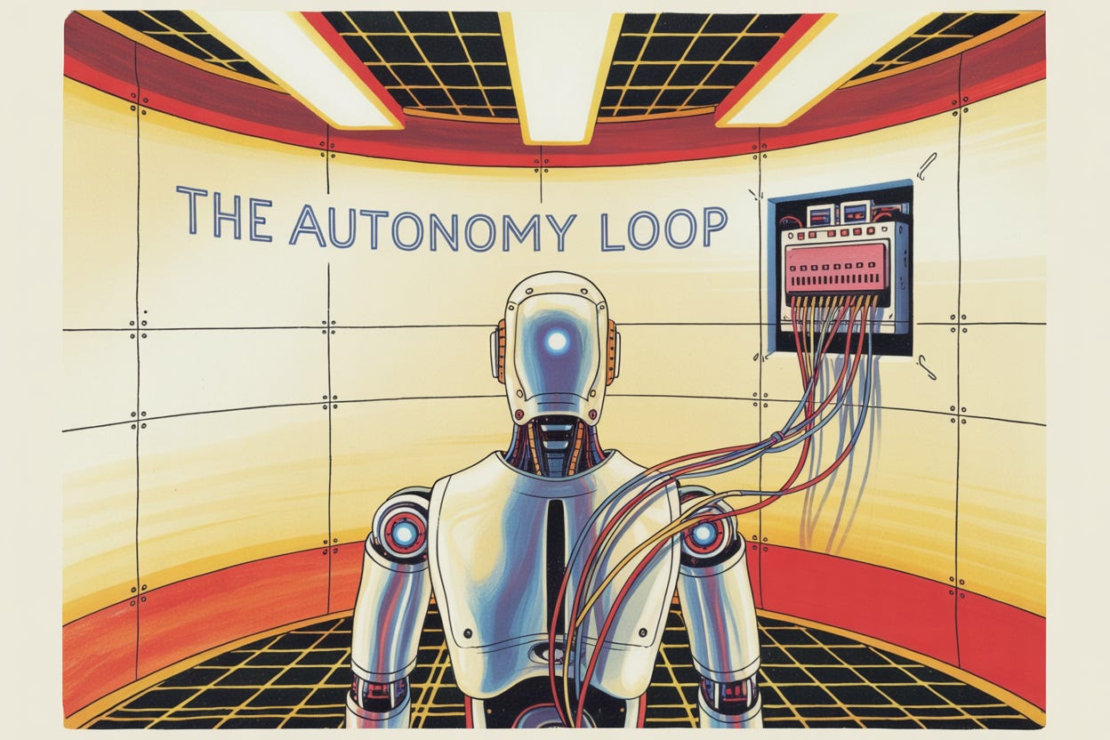
An Autonomy Loop is a self-contained system where the friction encountered by the user triggers the guidance necessary to resolve it, within the interface itself. The energy of the confusion is captured and recycled into education.
Let’s look at a concrete example: Data Import.
The Old Way (Static UI): The user uploads a CSV. The system detects a mismatch. It displays red text: “Error: Invalid Date Format in Row 40.” The user is now stuck. They have to open Excel, find Row 40, fix it, save it, and re-upload. Or, more likely, they email the file to your support team.
The Liquid Way (Autonomy Loop): The system detects the mismatch. It does not throw an error. It generates a fix interface. It displays a new, temporary table: “We noticed Row 40 has a weird date format. I think you meant 2024, not 204. Is that right?” The user clicks “Yes.” The system fixes the data and proceeds.
The distinction is profound. The legacy error message shifts the burden of resolution to the user. The Autonomy Loop accepts the burden of resolution within the code.
This is how you scale without mass. You don’t hire ten “Onboarding Specialists” to fix CSV files. You build one loop that fixes them forever.
JIT Education (The HUD)
If we eliminate menus and settings pages, how does the user learn the product?
They don’t. The concept of “learning the software” is anachronistic. No one “learns” TikTok. No one “learns” Uber. The product is the instruction.
However, B2B workflows are complex. When explanation is necessary, we must reject the concept of the “Help Center” or the “Knowledge Base.” These are separate destinations that force context switching.
Instead, we implement Just-in-Time (JIT) Education. We treat documentation not as a library but as a Heads-Up Display (HUD).
Information is exploded and scattered across the interface, appearing only when relevant.
The explanation of what an “API Rate Limit” is should not live in a wiki. It should appear as a tooltip the moment the user hovers over the rate limit setting.
The strategy for “Email Drip Campaigns” shouldn’t be a blog post. It should be a sidebar that slides out the moment the user creates a new campaign.
We strip onboarding down to the absolute minimum viable action required to see value. We do not teach the user about the “Advanced Reporting Module” on Day 1. We wait until they have logged in for the tenth time and clicked the “Report” tab. At that specific moment of intent, the product intervenes.
This turns the software into a mentor. It maintains the illusion of user competence. The user feels like a genius because the answers are appearing before they even ask the question.
The Death of the “User”
Ultimately, the Liquid Interface represents a change in the relationship status between human and machine.
For forty years, the human was the “User” and the machine was the “Tool.” The human was the operator. The human had to know which lever to pull. The tool was passive.
The Liquid Interface makes the tool active. It makes the software an agent.
In the Empty Corporation, we are not building tools for users. We are building environments for outcomes.
If the outcome is “Closed Books,” the interface shouldn’t be a calculator; it should be an automated accountant that presents a finished ledger for approval. If the outcome is “Generated Leads,” the interface shouldn’t be a database of phone numbers; it should be a list of booked meetings.
We are moving up the stack. We are moving from selling the drill to selling the hole.
When you achieve this, you no longer need “Customer Success Managers” to bridge the gap. You no longer need “Implementation Teams” to set up the tool. The tool sets itself up. The tool explains itself. The tool heals itself.
The interface becomes liquid, flowing around the user’s intent, filling the gaps in their knowledge, and solidifying only when it needs to deliver a result.
And when the interface is liquid, the organization can be solid. It can be small, dense, and incredibly profitable. Because you aren’t paying humans to point at screens anymore.
You have finally let the software do the job it was born to do.